The landing page of your website could be the thing that boosts your sales or decreases your audience. It is the first thing new customers see about you and your brand which is why it is best that you capitalize on this page. Use it as a chance to convince your audience to stay.
To improve your landing page you must:
- Have a short, yet compelling copy
- A call to action, something your audience is inclined to do immediately after reaching your website
- Social proof of your brand’s quality
- An explanation of what they are going to get from coming to your website
- A video or photo that introduces you and your brand
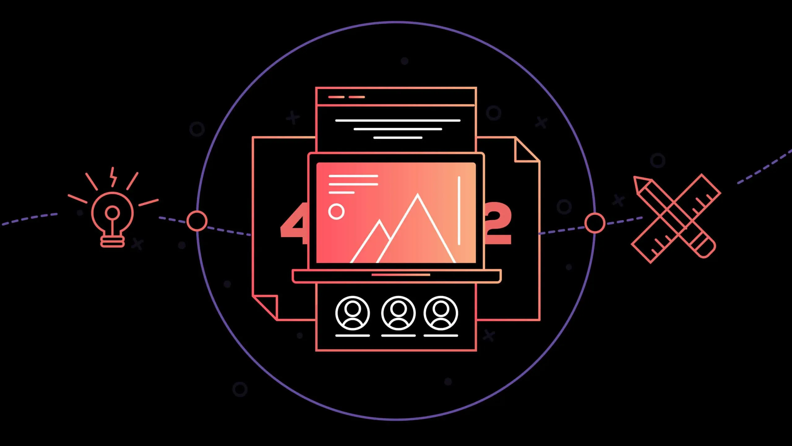
Here are 42 websites that did a great job with their landing page. You can use their tactics and designs to come up with cool ideas for your own landing page, so you can improve your conversion of prospects to customers!
1. Amazon
With their call to action being the first thing you see, Amazon’s impacts the page visitor immediately. The landing page uses video to further explain their offer and features Jumanji’s movie stars as a means of marketing. The page then directs visitors to other related products that they may be interested in.
2. Uber
Uber’s landing page calls to a relatable experience of its audience, a flexible work schedule. With this statement, they catch the attention of their audience and have a form nearby, just in case they want to enroll immediately. For those more convincing, Uber makes three clear points as to why driving with them is a great idea directly under their sign up form.
3. EF Ultimate Break
EF Ultimate Break’s landing page features a vibrant video upon entering the site. It boasts an impeccable deal, right from the get-go, in bold letters. It calls the reader to explore the rest of the page, which is filled with photos and explain why you should travel through them. All of their deals are directly under the hero image and the more you scroll the more you want to know.
- Snapchat
With bold on-brand colors and the use of a video, this landing page explains exactly what you are getting. It also uses animated graphics to show the functionality of the website.
5. Sticker Mule
This landing page uses animation to guide you through the page with a play copy that explains their product. It has an entertaining high-quality video that gives a little background on the hot cause and buyer reviews at the bottom with real photos.
In addition, they add recipes to the page that you can make with the hot sauce, giving viewers an idea of how to use it
6. Masterclass
Master Class capitalizes on video in its hero section, leading with a clear message of what you are getting from them. This page offers more details as you scroll, including testimonials, social media share links, and more content the audience would be interested in.
- HelloFresh
HelloFresh greets its audience with the face of Jessica Alba and a date night theme. The page begins with a call to action with a romantic floral theme. As you are led down the page by this cohesive content, the process HelloFresh uses is explained. The relatable imagery aligns perfectly with each section of the page enhancing what it explains.
8. H.BLOOM
H Bloom uses elegance on its landing page, with a beautiful font and floral arrangements to give you a taste of what they offer. Directly next to the introduction is a form, guiding you to contact them if you like what you see. Below, they explain how the website works, which makes the process less intimidating and easy to understand.
9. Litmus
Litmus starts with a friendly message ‘let’s stay in touch’ and makes the user experience simple by only requiring one field to be filled out. No need to put in tedious or unnecessary information. Their colors are firm and cohesive and they guide you down to the past newsletters for you to peruse at your leisure.
10. Contently
Contently’s copy comes in the form of a pop-up, which makes sure that you don’t miss it. A testimonial follows up this experience, inspiring confidence in potential customers. As they delve deeper, the information available is clear and concise. It uses simple icons to deliver their message.
11. Muck Rack
Muck Rack wants to hit 2 different types of individuals and they do it well. Their landing page carries a clear message for both groups, with a slide-in form that grabs your attention when you hover over the call to action buttons. The sections you find as you scroll down the page follow a list format. The list items point out the primary benefits for each group’s use of the site, and the sections are followed by reviews and testimonials.
12. Basecamp
With its menial design, Basecamp used an animated character to introduce you to their website. The headlines show the audience how many new companies have signed up and we can see why they are eager. Basecamp offers a 60-day free trial, without the need to enter credit card information.
Basecamp Bonus:
Basecamp Bonus straightforwardly tells you, how their platform can help you improve your efficiency, by using customer testimonials and exact numbers. You can sign up using your Google account or just use an email address.
13. TBS
TBS manages to begin their landing page with a soft yet to the point copy. They also manage to give enough details about their ‘swag sweepstakes’ in as few words as possible. Most of the information the audience needs can be found in a video and with the use of a celebrity, they make the offer more human and relatable.
What’s about this landing page is that they tell you what you can win if you fill in the form. So there is no need for you to search through the website!
14. Codecademy
Simple, beautiful, and functional. Codecademy uses a clear page design with a few animated images to give you a distraction-free headline and a bright call to action button that is hard to miss. You can log in with Facebook or Google+ and it answers any question you have with a video from a student who speaks to the audience.
15. Groupon
Groupon has a simple heading with a white form for you to fill in. There is relevant imagery on the page, ensuring there is activity added to the blank background.
16. Patreon
Patreon greets its audience with the work of artists, and you can immediately understand the focus of the website. It draws you in with aspirational language while it asks you to join them and support artists. They have a bright call to action button with a quick explanation of how Patreon works that follows in a pop-up.
17. CampusTap
This landing page starts with a beautiful image of the library. There is not much text, creating a focus on what’s important. A call to action button begins the user experience on the website.
18. Todoist
Todoist starts by making you think about yourself by prompting with a simple statement saying “over 2 million people are doing amazing things with Todoist”. Their button allows you to sign up quickly and their background carries you through different ways in which you can use the app.
19. Wave
Wave starts with a strong, emotional headline and image of a customer who addresses the audience with a smile. The form to join holds very few fields making it easy to sign up.
20. Vivino
When you reach Vivino’s landing page you are met with a black background and red buttons prompting you to download their app. The headline is simple with an undeniable reason to choose them.
21. Last Days of Ivory
This landing page has a black background with impactful text in white, indicating that if you click the button, you can actually do something about the terrorism that is happening outside of your home. It makes you want to take action immediately.
22. Trulia
Trulia’s landing page is a picture of a woman on her couch, with the copy and form centered in the middle of the screen. This contrast of the dark background draws focus to the form, which will guide you through the website.
23. Shopify
Shopify starts to build the trust of its audience by saying “Trusted by over 150,000 businesses worldwide”. This begins to build necessary credibility for the platform. There is a video that explains what Shopify offers and the form to sign up asks for the essential information.
24. Applause
Applause makes it known what they offer through their header and bullet points and a condensed form quickly follows. The reassuring statements and logos of existing customers also build confidence in new clients, in addition to the numerous tweets.
25. OFFSET
Offset has a short page with a heading that explains the purpose of the website. It is followed by a simple form that once filled out allows you to explore Offset. This content is placed over a whimsical animated image, which ties the page together.
26. Tumblr
Tumblr’s minimalist approach relies on its simple yet beautiful image to draw the eyes of viewers. A simple form and the blue call to action prompt the user to joining Tumblr. The numbers at the bottom of the page showcase the amount of usage Tumblr sees and serves as social proof of the platform’s trustworthiness and popularity.
27. LaborSync*
Laborsync’s purpose can never be mistaken with its purpose as it is stated clearly in the headline. The author bio inspires trust and confidence and the free ebook form carries four fields, which makes conversion easier.
28. Drift
The Drift landing page is very simple, with black text on a white background, but with excellent design. Immediately Drift makes you aware that SaaS will help your sales team generate more leads, schedule more meetings or consultations. You are given a chance to test the waters before you buy, with a 14-day trial. There are also testimonials available for viewers to read before they make any commitments.
29. Quick Sprout
Neil Patel tells you what he’s going to teach you and how you can get access to the webinar as soon as you reach the landing page. The language inspires a more personal feel, when reading the information, like a one-on-one session. The information is laid out in an easy to read can concise fashion.
30. Unbounce
Unbounce starts with a large image that advertises their ebook and lets you know what is in it for the get-go. This information is easy to read throughout their landing page. At the bottom of the page is social proof as seen by the logos of companies with who they work.
31. Blue Apron
Blue Apron, uses an easy to follow format which makes joining them seem so simple. It only takes three steps! Their audience can take comfort knowing that there is no commitment and are informed of their personalized menus and delivery.
32. Slack
Slack does not hesitate with immersing their audience into their product by placing a video in the hero section. This video lets you know how simple slack is to use. As you scroll down the page, all of Slack’s major features are listed and gently persuade you into understanding the value of their product.
33. LastPass
LastPass begins its landing page by explaining how easy it is to set up and start using their product. They detail the product’s information. Making it easy to understand why you would need it to coax you into the idea of using their product.
34. Zoom
Zoom greets its audience with a minimalistic design and with one entry, you can get started with their software. They carefully explain what is included in their packages and display how it would look when you are using Zoom. They also offer a live chat, which is very convenient for answering questions on the fly. Keeps the form as minimal as possible; only one field to get started.
35. Plated
Plated hits the eye with a vibrant color scheme and a Clear explanation of their plans. You can select how many meals you want to receive each week and testimonials make the user feel more confident in the food.
36. Magnolia Market
The Magnolia Home has an inviting landing page, prompting you to come and stay with them. It tells you when you can book, and displays customer photos so that you can get a more realistic feel of where you are staying. It is easy to make your bookings and they offer a newsletter which you can subscribe to.
37. Bombfell
Bombfell gets straight to the point, describing how they can help you and steps you need to take to use their service. It makes the process look easy and creates comfort in viewers by letting them know that you only pay for clothes you like.
38. Wayfair
Wayfair’s gift registry page is beautiful. It takes the viewer from step to step and highlights featured brands. Logos along the page highlight who Wayfair works with and they justify why you should choose them over other options.
39. Square
When you load Square’s website, you are met with friendly faces and a chance to choose what you want from the website all in the hero section, once you select your needs, the page is personalized. If you continue scrolling down the landing page a video follows, along with a few points about the website and testimonials.
40. Yale Appliance*
Yale presents an easy to use experience with crisp imagery in the hero section and a call to action button. The user can get to know what they want and follow the instructions on the page as laid out.
*Editor’s Note: Yale Appliance is a current IMPACT Client.
41. HubSpot
HubSpot uses simplicity to make it effective. They tell you what you are getting from the beginning. The words “saving countless hours” create an emotional connection to the reader and is quickly followed up by social proof of their resources.
42. Salesforce
Salesforce carries short and sweet content and in no time, the audience is aware of what this company offers as it is clear on the landing page. With positive reviews from NordVPN, this company can draw in customers who believe in its ability.

